Improved
Visual & Experience Updates Across the App
9 months ago
We’ve made a broad set of visual, layout, and content improvements to create a cleaner, more consistent experience throughout the app.
A More Polished Look
- Added mirrored icons next to page titles for better visual alignment with the navigation.
- Refreshed tab styles with a modern look and a subtle gray background for active states.
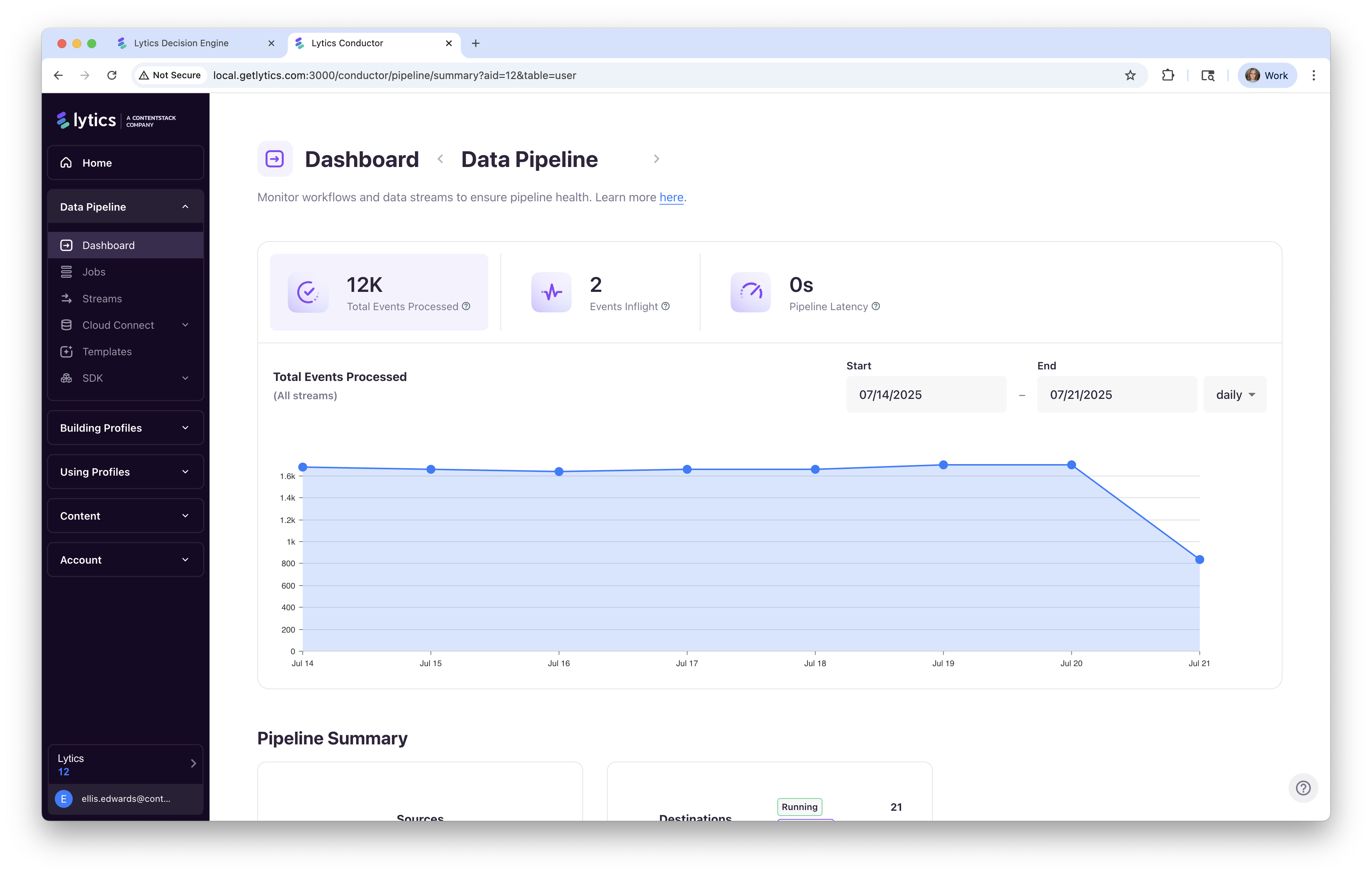
- Updated icons and colors in the home “status module” for better readability.
- Overhauled the Streams page layout, especially the top section, for improved clarity.
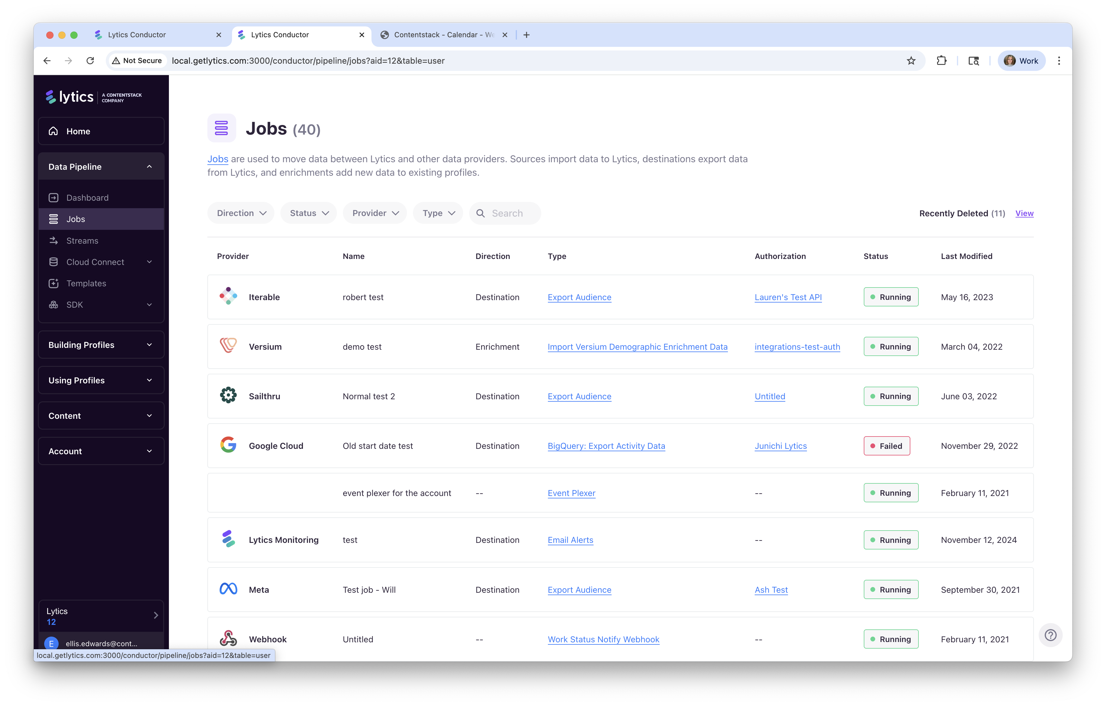
- Standardized list page layouts (like Jobs) using our newer filter and search patterns, with tables now extending full‑width.
- Applied the popular “deleted jobs” table style — including provider icons — to the main jobs area for a consistent feel.
- Matched the recently deleted jobs entry point to the current layout.
- Updated hover states on cards to use the clean purple outline style.
- Improved layouts in Settings by removing repetitive text and moving helpful information into tooltips.
- Polished the status/details module found at the top right of many pages.
Consistent Content & Structure
- Added missing descriptions to pages for better context.
- Ensured consistent page headers and section titles across the app.
- Standardized title wording to match the navigation.
- Consolidated headers, section labels, and general styles for a more uniform feel.
Typography Improvements
- Cleaned up and aligned typography with our theme styles to reduce one‑off overrides.
- Added reusable theme styles for commonly used typography.
- Applied comma formatting for large numbers (e.g.,
1,304instead of1304) across key areas.
Icons & UI Components
- Added new icons, including Users and Data Pipeline Dashboard.
- Styled the pill switcher and applied it throughout where applicable.
Personalization Logic
- Enhanced the Home page welcome message:
- Extracts first name from email when possible (or uses the explicitly set name).
- Shifts from “Hey, ** – let’s get started” to “Welcome back, __**” once you reach certain milestones.
- Follow‑up improvements coming to better detect names and ensure graceful fallbacks.
These updates bring a cleaner, more unified experience across the platform while improving clarity, consistency, and personalization.