Components
Introduction
Reports can consist of one or many Components. Think of a Component as a method of visualizing data. Each Component provides different ways of displaying and drilling into your data.
Supported Components:
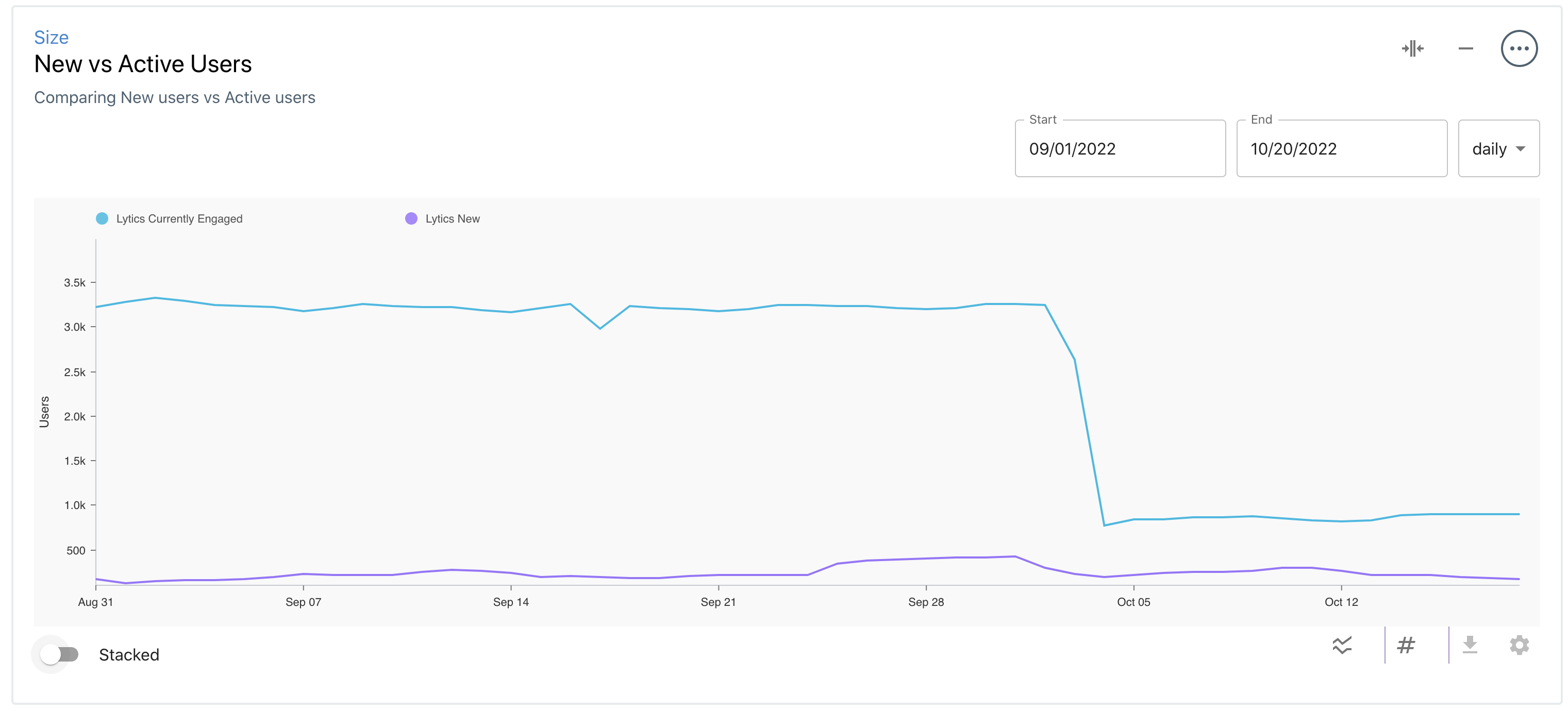
- The Size component allows you to display the sizes of one or more Audiences as a line chart or numeric value. This component helps compare the sizes of different Audiences (ex: for A/B testing).
- The Composition component allows you to understand and chart the distribution of values for a field across your audience in various ways, including Bar, Pie, Line, and Table view.
- The Audience Overlap component allows you to understand the intersection or difference in audience members between two or more audiences.
- The Data Flow component allows you to visualize the flow of data that connects your Providers, Audiences, and Destinations.
Creating Components
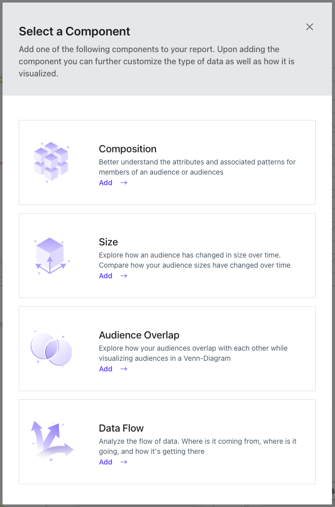
You can select from a list of Component types by clicking the + Add New Component button on the Report Page. Click on the desired component to add it to your Report.
Managing Components
Lytics provides a handful of methods of managing your Report Components.
- Configuration: Once you've created your Component, click on the Edit Component button in the lower right corner to configure your Component.
- Minification: To minimize, or hide a component, click on the minimize(-) icon in the upper-right corner of the Component.
- Stacking: Merge multiple data points into a single visualization or separate each point into its unique component for streamlined consumption.
- Shrink/Expand: If your Report has many components, it may be desirable to 'shrink' your components to display more information on a single page. To shrink your components, click on the "Shrink" icon in the upper-right corner of the Component.
- Deleting: Click on the expanded menu in the upper-right corner to delete your component.
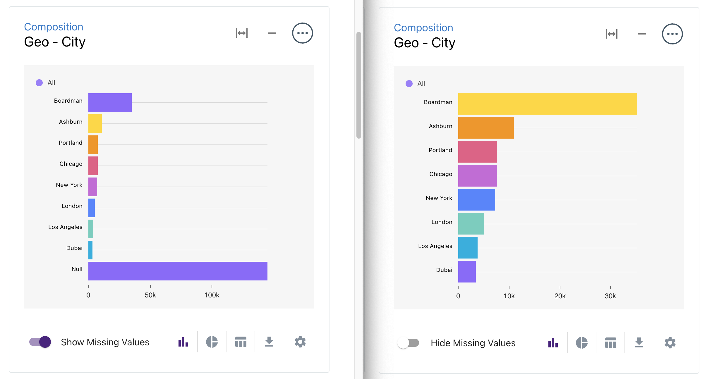
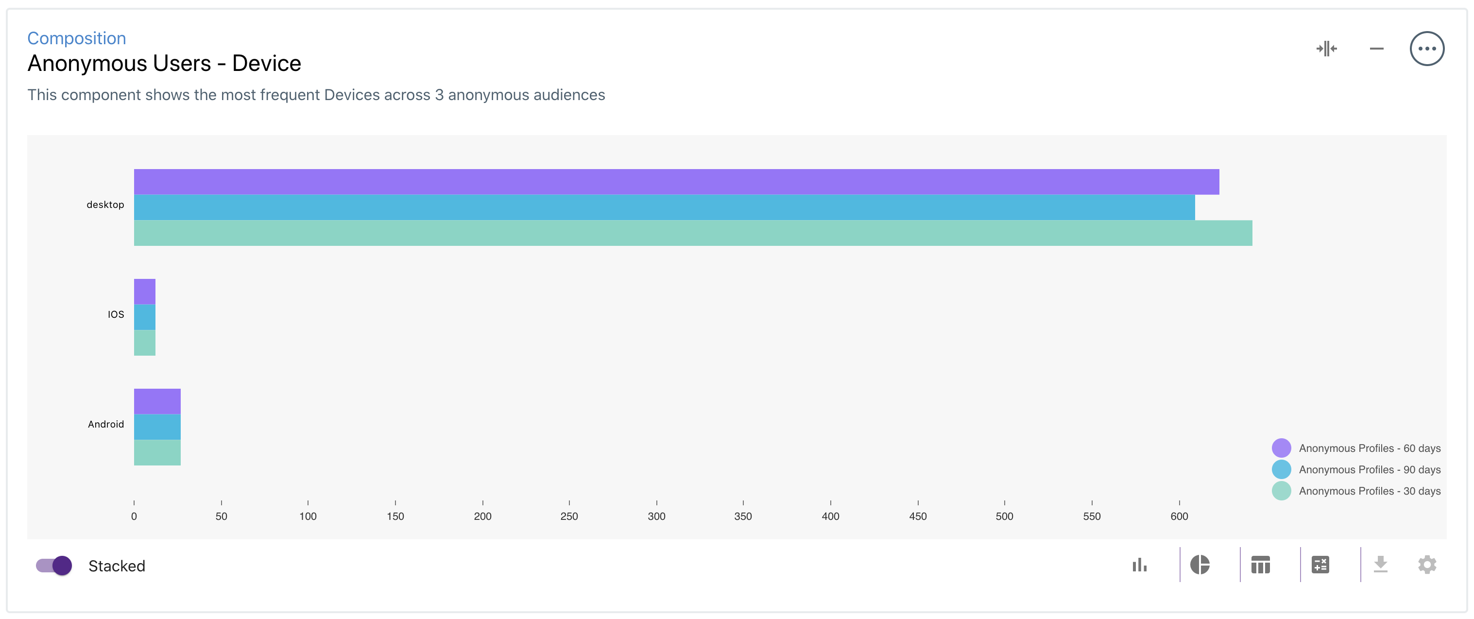
- Hiding/Showing Missing Values: By default, "null" values are hidden from view. This prevents individual component visualizations from being offset by profiles with missing data. For instance, in the two examples below, you'll see an overview of visitor geo, but if we "show missing values," you'll see a large portion of the users in the audience do not have a geo value at all. This may be preferred in some cases and can be toggled on or off to meet your needs.
- Organization: As you add components, you will likely want to customize where and how they appear. The location of a particular component can be adjusted easily by simply clicking any edge of a component and dragging it to its desired location. Don't forget to save your changes so they are retained the next time you visit your report.
Component Types
Size Comparison
Size Comparison components allow you to display multiple Audience Sizes on one chart. This component can help compare multiple audiences simultaneously, commonly used for variation testing.
Creating and Editing Size Components
To create a Size component, select one or many Audiences in the Edit Component menu. In the configuration menu, you can set the Component's name, description, and Audiences based on the selected table. After selecting and saving the Audience(s), the Component will display a time-series chart of the Audience size(s).
Customizing Size Components
Once a Size component is created, the time-range and the stacked options can be selected.
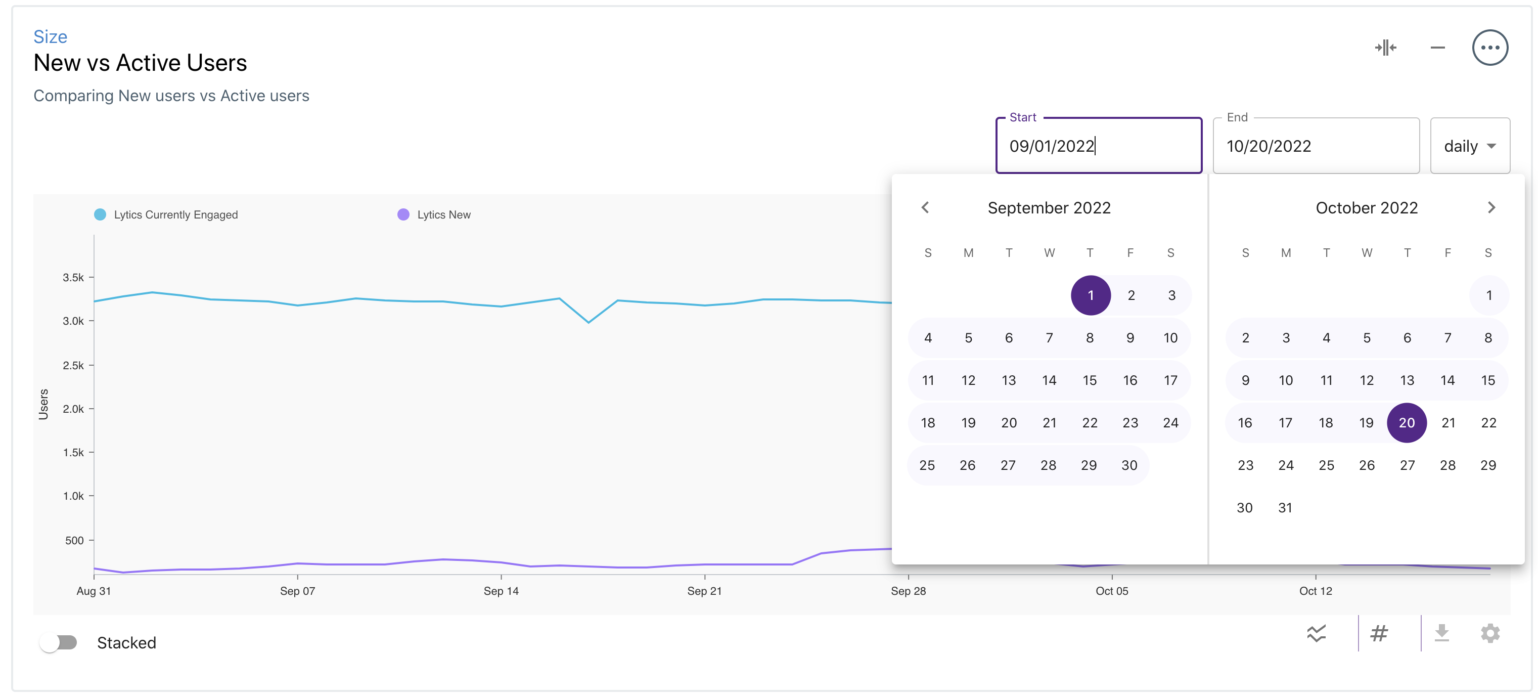
By default, the Size component will chart the last seven days of data. To customize the start and end dates, click on the dates in the upper-right section of the component.
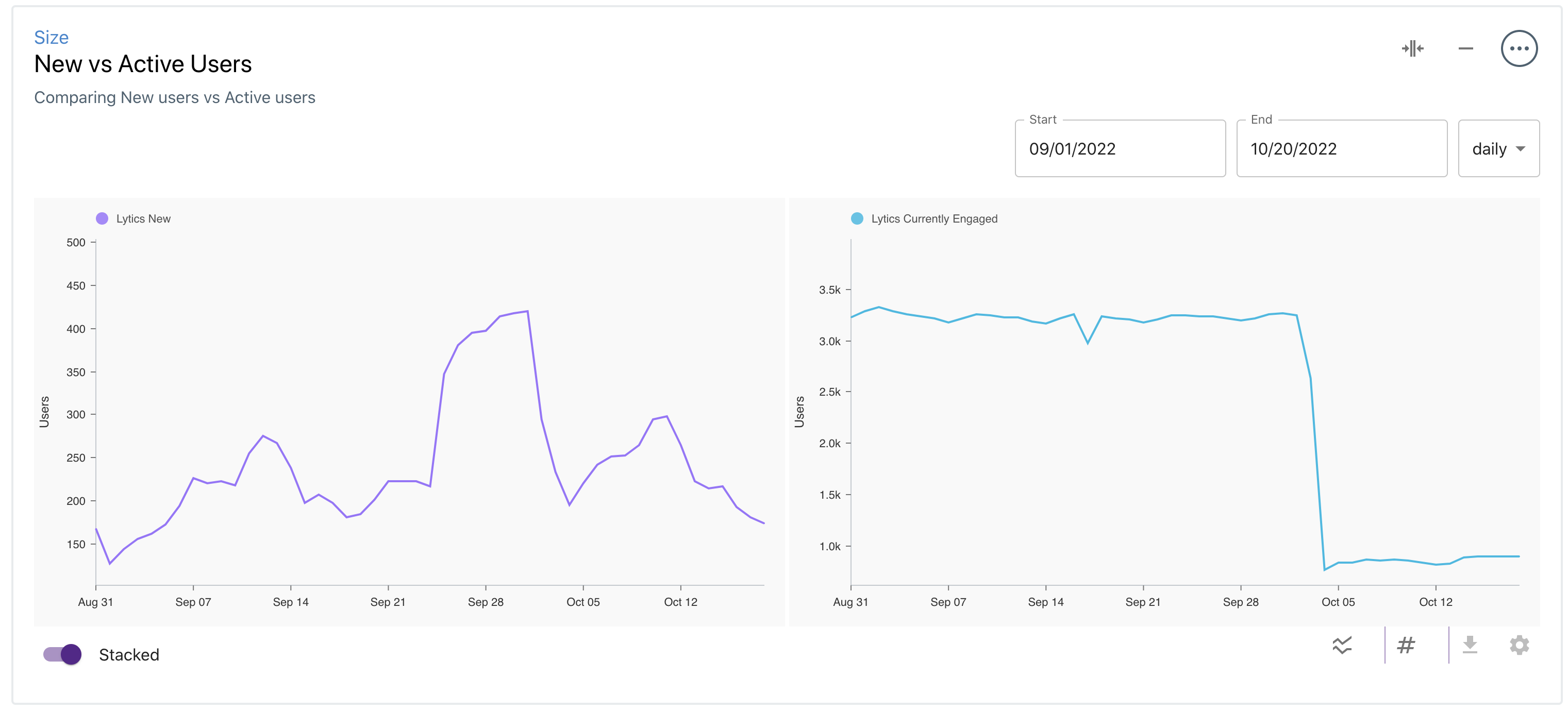
To display the Audience sizes on separate charts, toggle the Stacked option in the lower left section of the component.
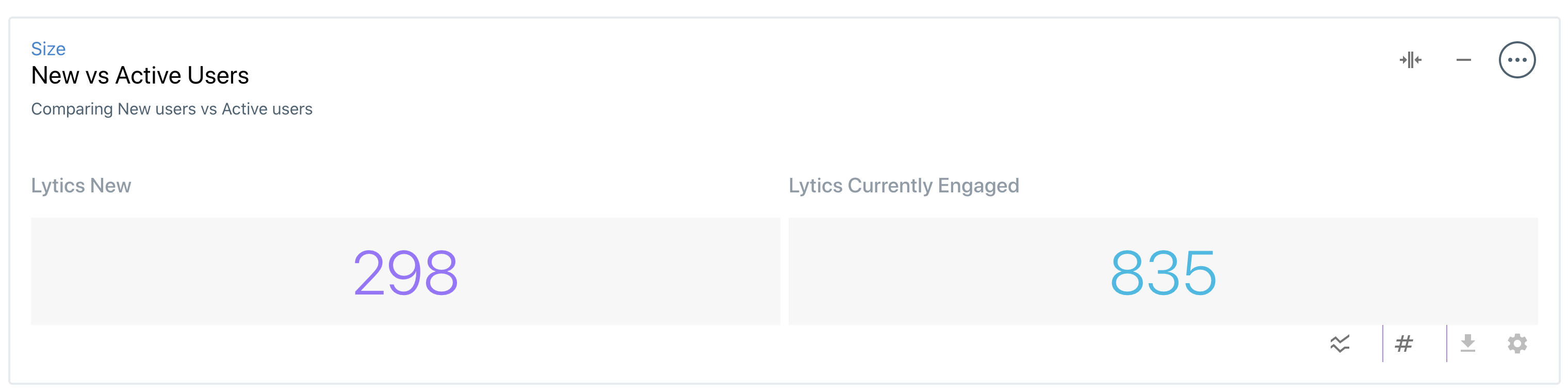
Size components can also be visualized as a single number by selecting the Number chart type.
Audience Overlap
Audience Overlap components allow you to understand the intersection or lack thereof between two or more Lytics audiences.
Creating and Editing Overlap Components
To create an Overlap component, select one or many Audiences in the Edit Component menu. In the configuration menu, you can set the Component's name, description, and Audiences. After selecting and saving the Audience(s), the Component will display a Venn diagram representing each audience and their collective overlap.
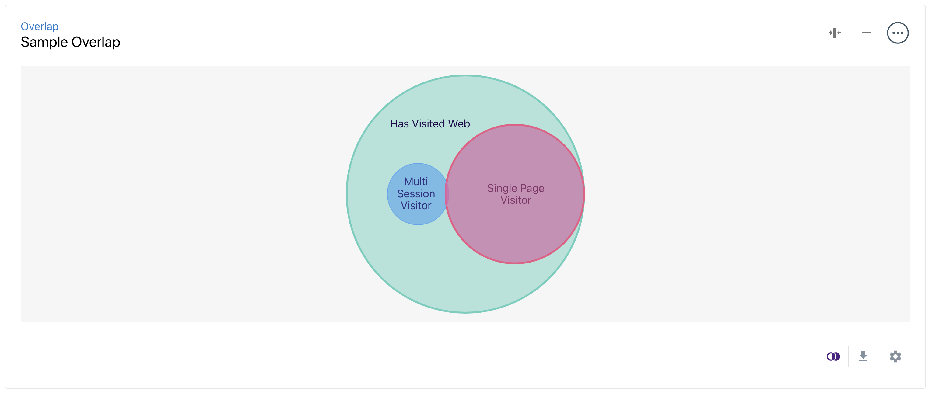
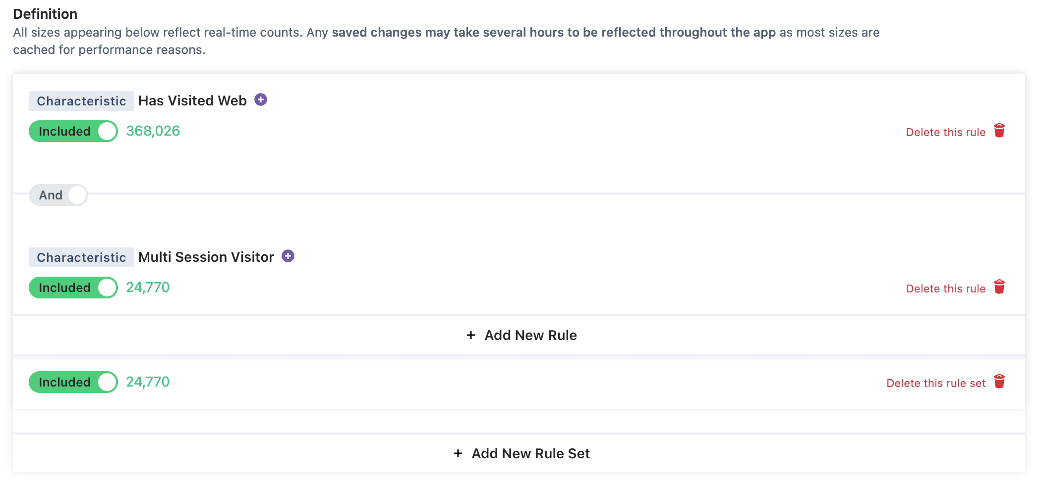
Activating Insights
These insights can be quickly activated by clicking directly on any intersections. This will take you to a pre-populated audience definition with rules defined representing the portion of the diagram you clicked on. For instance, in the above example, clicking on.Multi Session Visitors within the Has Visited Web audience will produce the following audience definition.
Data Flow
Data Flow components allow you to see how data flows through your connected Providers, Data Streams, Audiences, and Destinations.
Creating and Editing Data Flow Components
To create a Data Flow component, select up to 5 Audiences in the Edit Component menu. In the configuration menu, you can set the Component's name, description, and Audiences. After selecting and saving the Audience(s), the Component will display a Bipartite diagram containing each of the selected Audiences and the connected Providers, Streams, and Destinations.
The Edit Component menu also provides options to hide (or display) the Providers, Streams, or Destination columns. This allows the user to "zoom in" on different aspects of the Data Flow diagram.
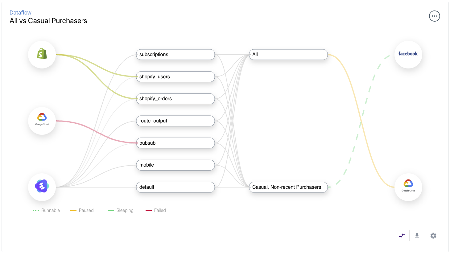
Activating Insights
Insights for this Component can be accessed by hovering over or clicking directly on any line in the diagram. Hovering over a line will prompt the Dataflow Tooltip, which contains information about the Job - such as when it was created and the number of users exported.
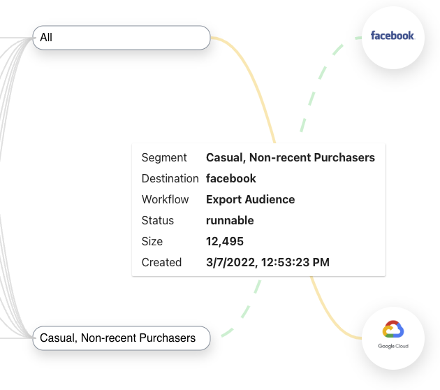
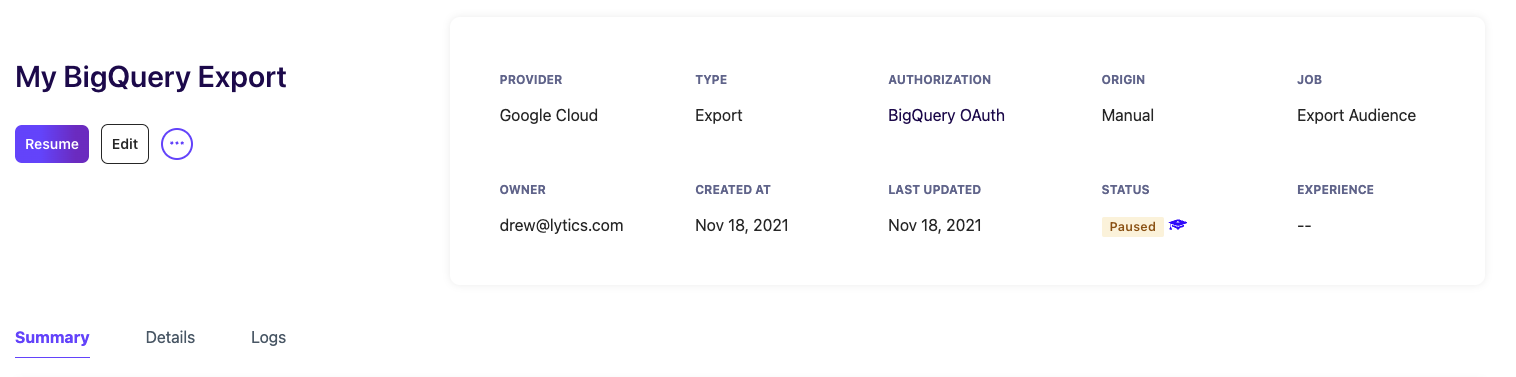
Clicking directly on the line will take you to the Job's page for the corresponding job. For instance, clicking on the yellow line between "All" and "Google Cloud" will redirect you to this page.
Composition
Composition components allow you to visualize a field in the user or content schema across one or many Audiences. This can be useful to compare a field across Audiences or to analyze the data distribution for a group of users.
Creating Composition Components
To create a Composition component, click on the Edit Component button. In the configuration menu, the name, description (optional), Audiences, Field and SubField can be selected. Depending on the field type, Lytics provides a variety of ways to visualize the data. The data can be viewed as a Bar Chart, Line Chart, Pie Chart, Table, or Stats view for numeric fields. The following table shows all of the chart types for each field type.
| Field Type | Bar | Line | Pie | Table | Stats |
|---|---|---|---|---|---|
| string | x | x | x | x | x |
| number | x | x | x | ||
| Date | x | x | x | ||
| []string | x | x | x | x | x |
| map[string]string | x | x | x | x | x |
| map[string]number | x | x | x | ||
| map[string]date | x | x | x | ||
| []number | x | x | x | ||
| []date | x | x | x |
Chart Types
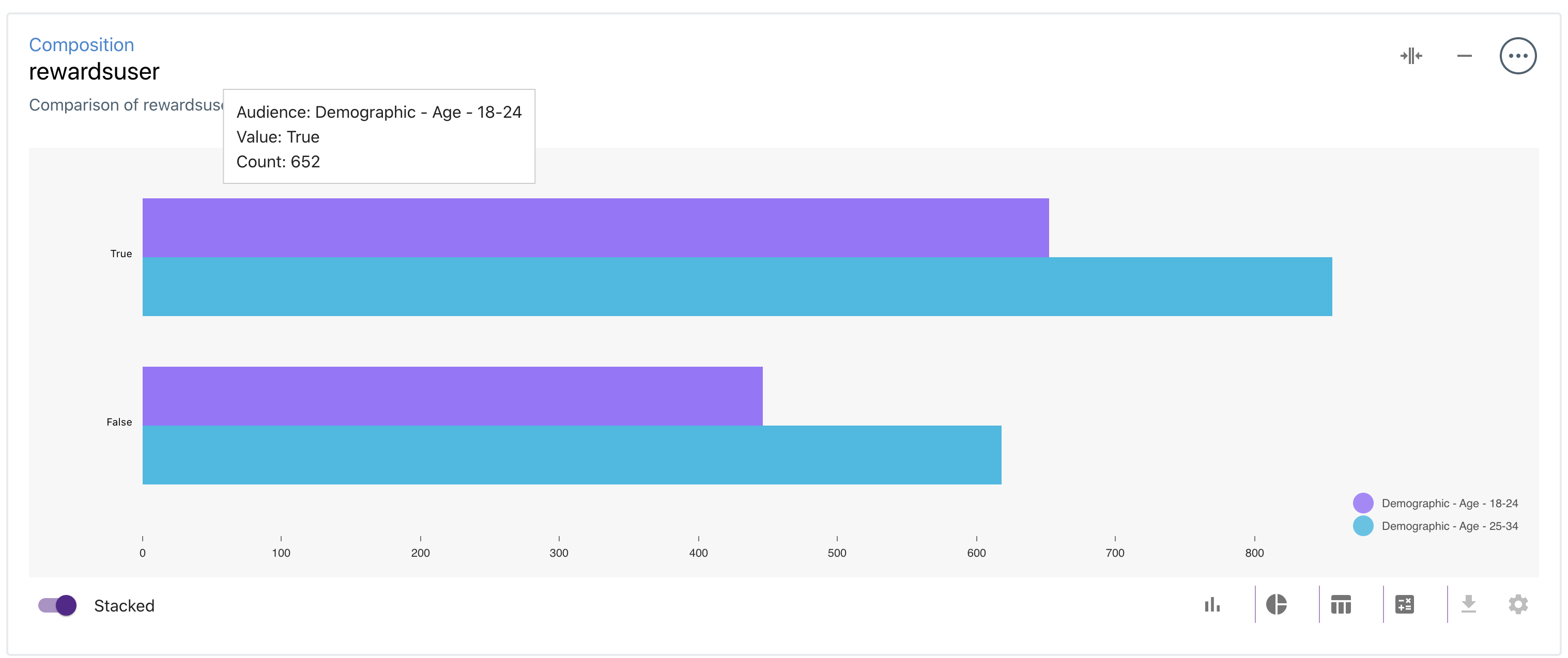
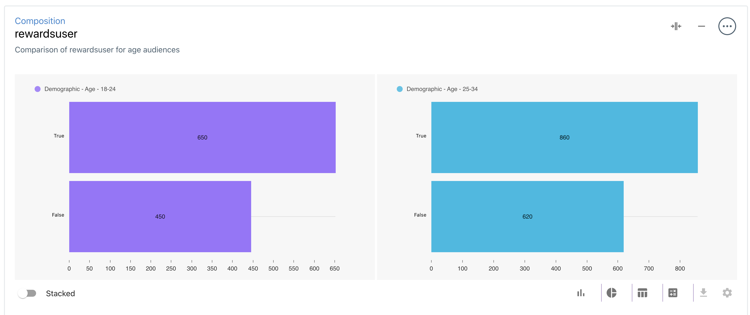
- Bar Chart: Display your data as a horizontal Bar Chart, where each Audience is represented in a different color. The labels correspond to each value of the Field, and the values are the number of users with the field value. Example: the Bar Chart below shows the number of Rewards Users across 2 Audiences.
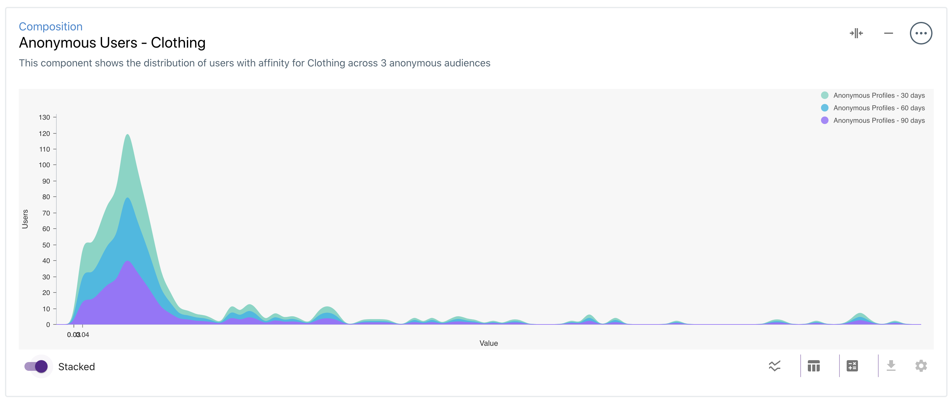
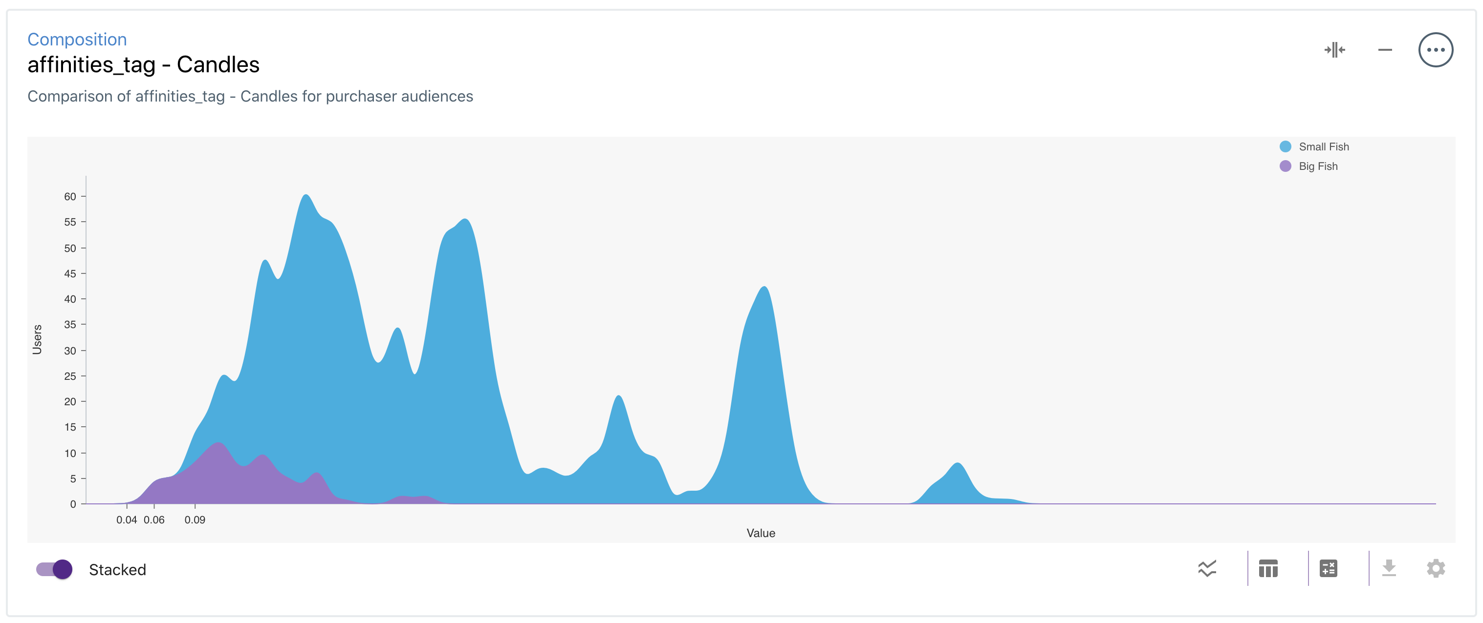
- Line Chart: Display your data as a Line Chart for fields of type number. The x-axis displays the field value, and the y-axis displays the number of users with a given value. Example: the Line Chart below shows the distribution of users with an Affinity for Candles.
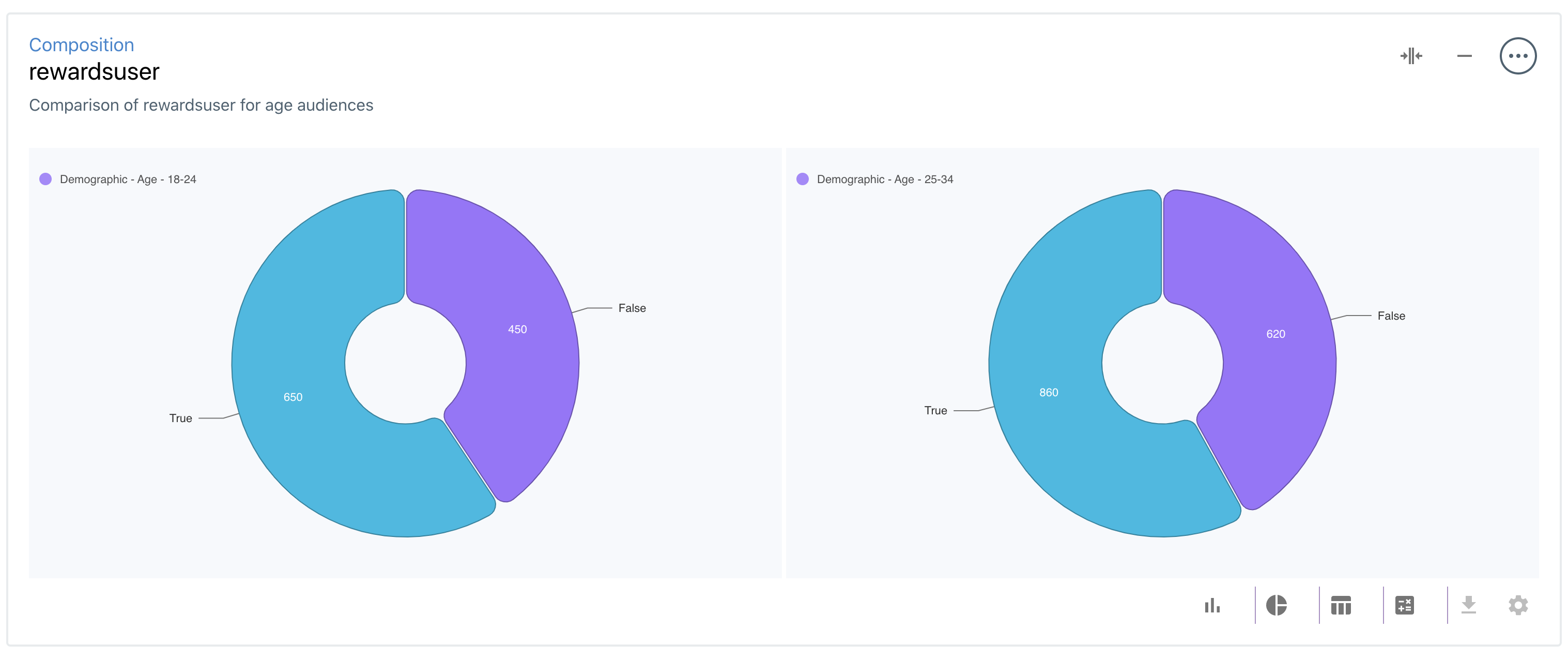
- Pie Chart: Pie Charts are particularly useful for categorical fields (ie string, []string types). Example: the Pie Chart below shows the number of Rewards Users across 2 Audiences.
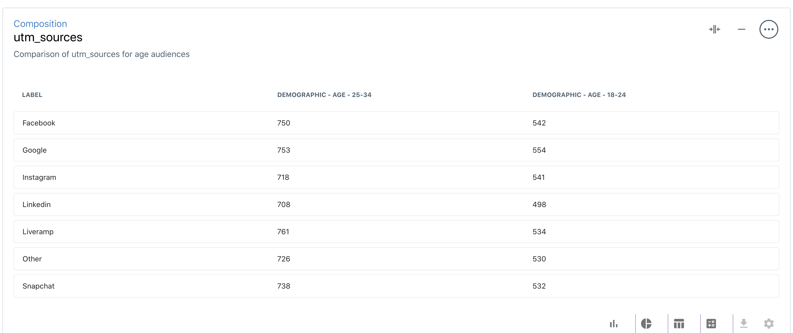
- Table: the Table view presents categorical or numeric data in a table format. Example: the table below shows the most common _UTM Sources_across 2 Audiences.
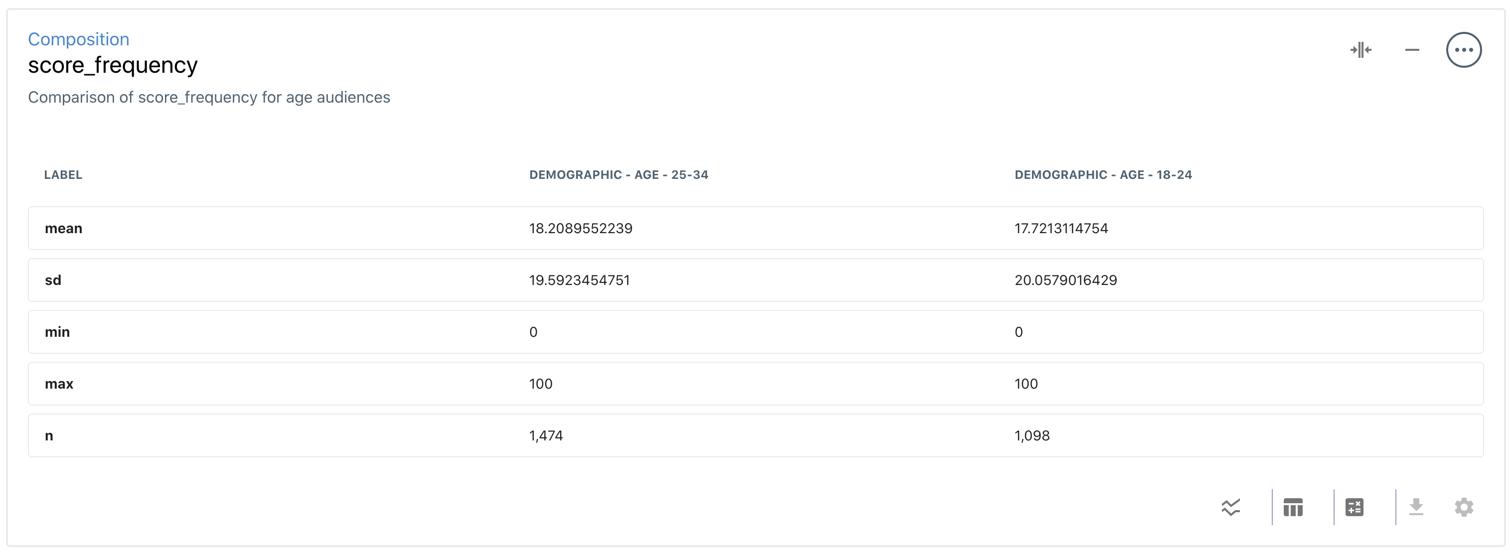
- Stats: the Stats view displays statistical information for numeric fields. Example: the table below shows the mean, min, max, standard deviation and number of users across two different Audiences.
Managing Composition Components:
Once you've created a Composition component, the bottom navigation bar allows you to customize your component. Here, you can select your desired chart type, toggle between stacked and unstacked charts, download data, and customize your component.

- Stacked: depending on the chart type, selecting the Stacked option will display the data on different charts. The image below shows an "unstacked" Bar Chart.
- Chart Types: The chart icons in the navigation bar allow you to switch between different chart types. Once you change a chart, you can save your changes by clicking on the Save button in the pop-up message:

- Editing Your Component: the Edit Component button on the right side of the navigation bar allows you to modify the name, description, Audiences, and Field/SubField associated with your component. Once your changes are saved, the data and charts will update.
Example: Charting UTM Data
As a first example, we'll walk you through creating your first Composition component using device data.
Example: Using Sub-Fields
As a more complex example, we'll chart the distribution of users' affinity for a Content Topic across two different Audiences.